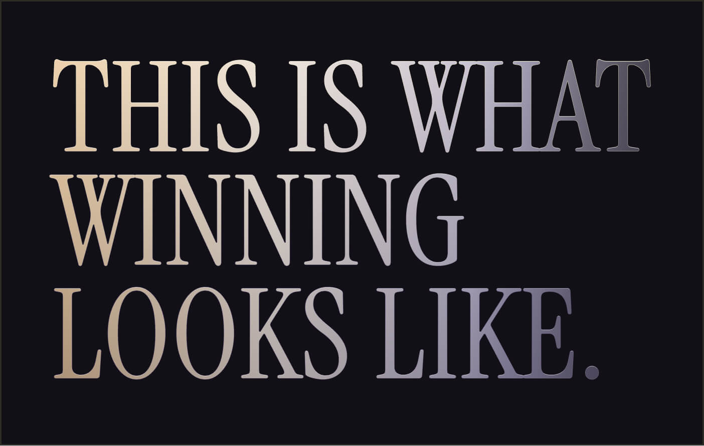
This is What
Winning Branding
Looks Like
Brand Guidelines
This guide sets the tone for how Hedge.fun shows up in the world. Inside, you’ll find the visual language, design principles, and core elements that keep our brand experience clear, elegant, and unmistakably ours — no matter who’s creating it or where it appears.
At its heart, Hedge.fun is about turning opportunity into something bold and tastefully unexpected. These pages define how we use color, typography, and accessible design to hold that promise together, while leaving space for curiosity and experimentation to shape what comes next.
Whether you’re designing a digital flow, a launch announcement, or a curated moment for our community, this guide ensures every touchpoint carries the same quiet confidence, sly charm, and welcoming edge that make Hedge.fun feel like the best room in the house.
Contents
01
Brand Strategy
02
Personality
03
Logo
04
Color
05
Typography
06
Iconography
07
Art Direction
08
Applycations
01
Brand Strategy
There’s a party at a bar tonight. The kind that feels like you need the right name on the right list. You check your pocket for the invitation, but it’s not there. Then you spot Hedgar by the back door, half-hidden in the alley. He catches your eye, grins, and waves you over. “Come on,” he gestures. You slip past the door behind him.
Inside, you pause. The room hums with style you’re not sure you carry yet. That creeping sense of “Am I supposed to be here?” curls up your spine. Then Hedgar looks back at you from across the bar, lifts his glass with a knowing nod, and it all settles: you’re exactly where you’re meant to be.

That is Hedge.Fun. A platform that gives everyone the chance to hold crypto assets with style, no matter how you start or how crazy a move might look. Build baskets that balance risk with taste, without needing a fortune to look the part. Come curious, come casual, come as you are. We’ll make sure to celebrate your wins, and cheer up for the looses.
🚪 The back door is the simple UI: you’re in, no complex initiation.
😎 Hedgar’s nod is the brand’s promise: “Relax! you’re holding well, you’re good.”
🥃 The party is the curated baskets, the stories, the style, the capital arranged tastefully.
😉 The strange feeling is the fear of crypto complexity. Hedgar dispels it with a wink.
1a
Brand Fundamentals
Our Mission: what we do
To make holding well feel effortless, tasteful, and thrilling — by turning diversification into an experience anyone can step into, style their way, and share with pride.”
Our Promise: how we help
We promise to share every opportunity. No gatekeeping, no exclusive clubs — just smart baskets you can make your own. Come as you are, hold like you mean it, and leave with a portfolio to celebrate.
Our Vision: why we exist
A world where anyone can step on-chain, build baskets as stylish as they are smart, and hold their capital with the same flair they live their life — open, confident, never ordinary.
02
Personality
2a
How Does Hedge.Fun Talk
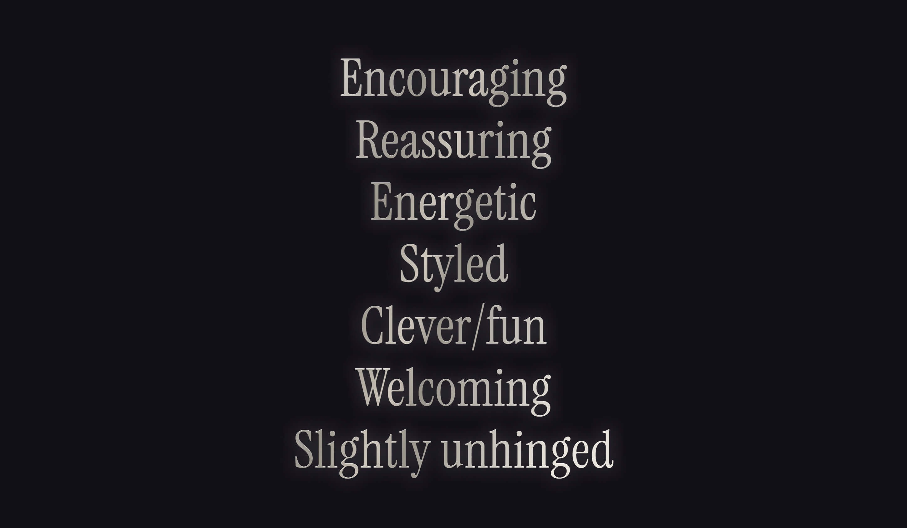
In short Hedge.Fun is...
✅ Open, but not cheap. It’s still a good party, a place you want to be. The door just isn’t obvious to everyone.
✅ Inclusive, but with a nod to taste. You’re here because you get it; or you’re willing to learn it.
✅ Encouraging and challenging. Trusts your potential.
✅ Charm replaces status. It’s not about who you know in high society. It’s about the confidence you carry once you’re in.
Hedge.fun is a charming provocateur in the world of crypto investing. It knows where the hidden door is and how to open it for anyone curious enough to step inside.
The personality is confident but never loud, balancing elegance with a sly grin that makes diversification feel like an experience worth sharing with everyone, regardless of their previous experience.
Come as you are, stay as long as you like, and leave looking better than when you arrived.
This brand speaks like a connoisseur friend to our two core audiences with different intents:
- The Creators
- The retail investor/investigator
2b
Towards Creators
When talking to creators, the brand will aim for giving any anon the chance to prove themselves. To prove that they deserve to manage money. It doesn't matter if they are boomer who discovered Ripple memes and realized they're better than all the so-called degens at trading; or a 15-year-old who's chronically online with a YOLO mindset.
Hedge.fun lets them create a track record. The idea is that they can start with a little pool of capital, just their own money, show their work, prove to the world that they know what they're doing, As they amass true believers because their portfolio is crushing it, those believers can invest directly in their "folio".
for its closest friends, he is still encouraging, but also challenging: "Prove you can do it. I believe in you"for retail, he is the guys that always compliments and shares warmth
2c
Towards Retail
When talking to retail traders, the brand will always encourage to explore their potential, and the oportunities ahead.
It will invite people to come and poke around, learn what always-on traders are up to, get a sense of what's trending, what the vibes are, maybe see some thought pieces, maybe bookmark and follow some people to see if they want to give them their money in the long term. It's a little bit like collecting Pokemon. It's a little bit like following someone on Twitter. It's a little bit like GMGN.
aim for giving any anon the chance to prove themselves. To prove that they deserve to manage money. It doesn't matter if they are boomer who discovered ripple memes and realized they're better than all the so-called degens at trading, or a 15-year-old who's chronically online with a YOLO mindset.
Hedge.fun lets them create a track record. The idea is that they can start with a little pool of capital, just their own money, show their work, prove to the world that they know what they're doing, As they amass true believers because their portfolio is crushing it, those believers can invest directly in their "folio".
1b
Tagline Samples
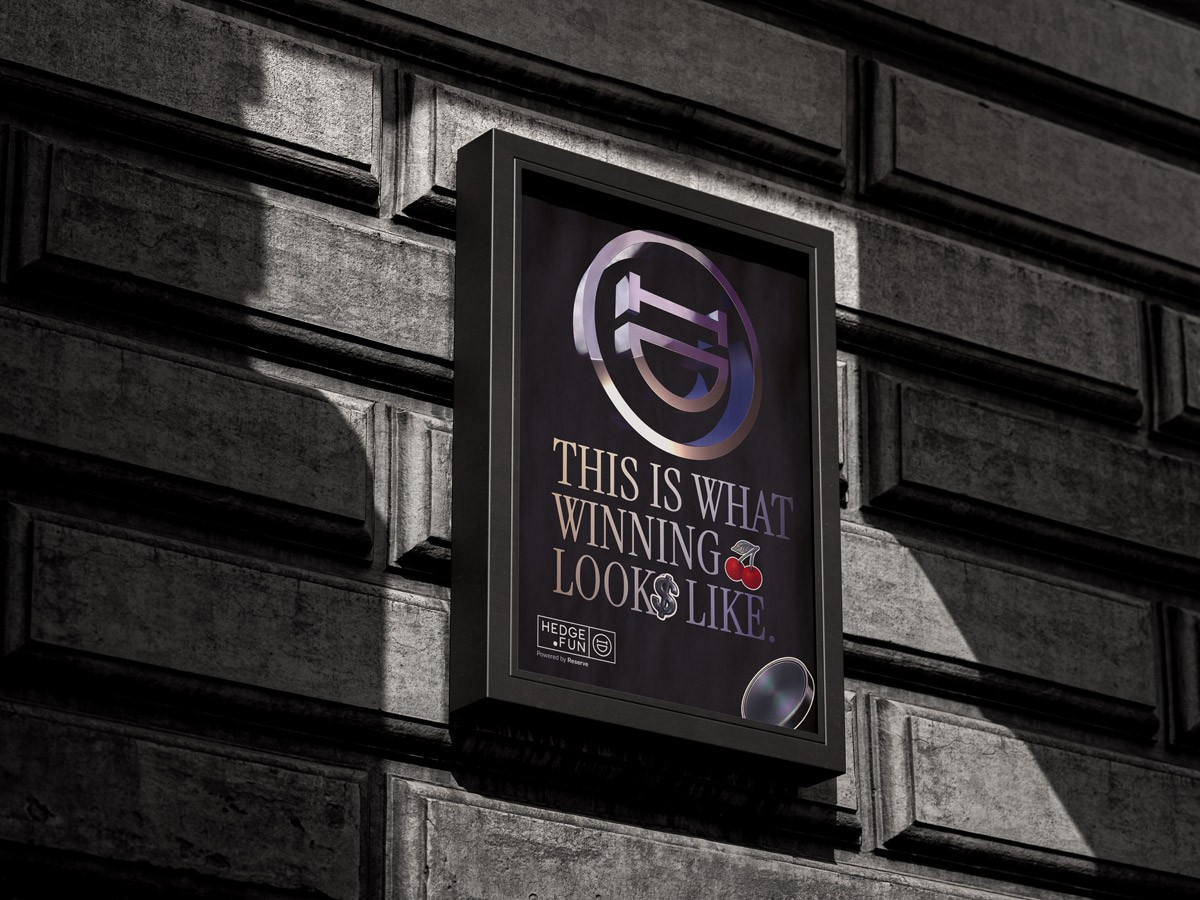
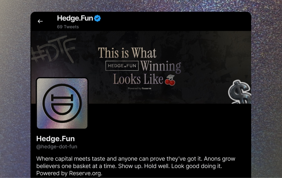
Alpha doesn’t screenshot itself.
This is what winning looks like.
The leaderboard is open.
Track records over hot takes.
03
Logo
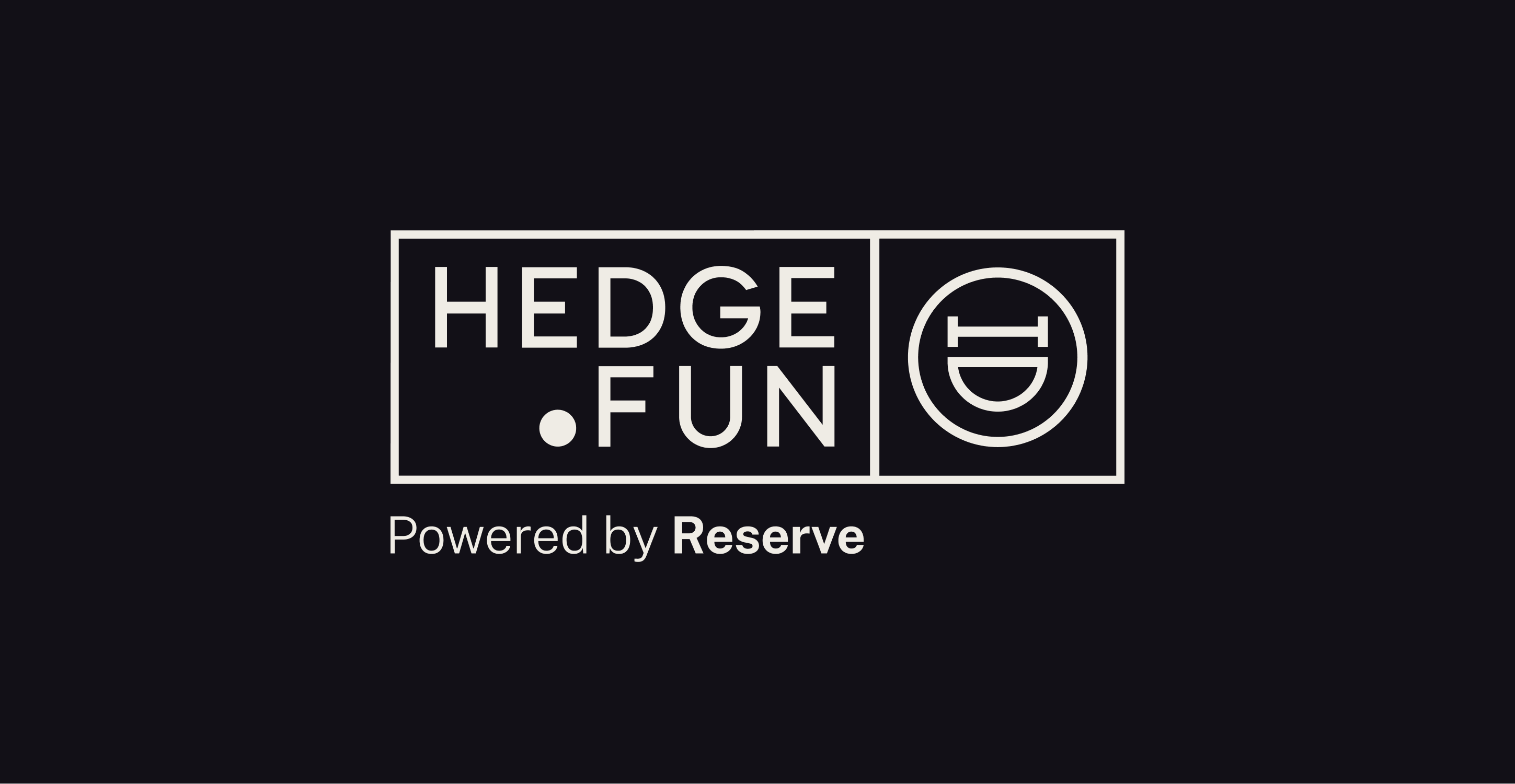
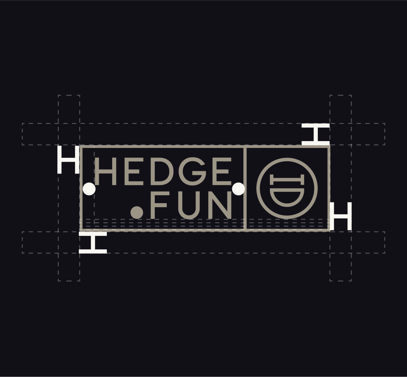
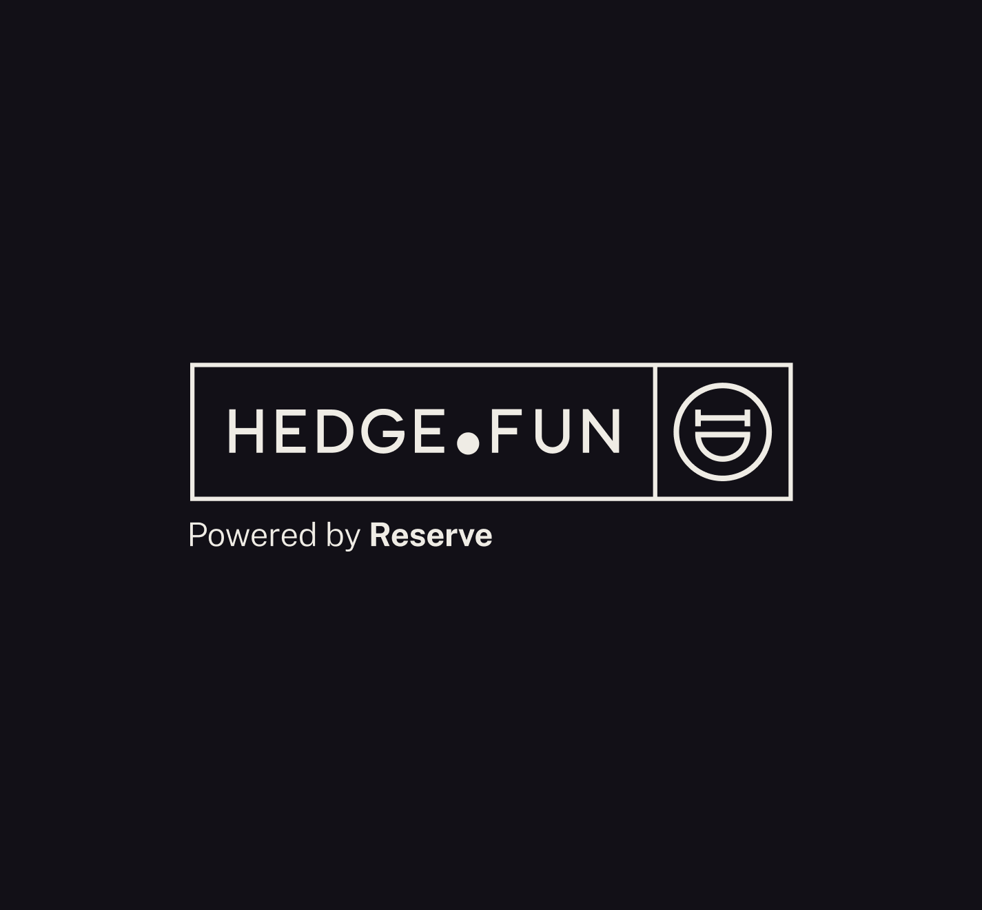
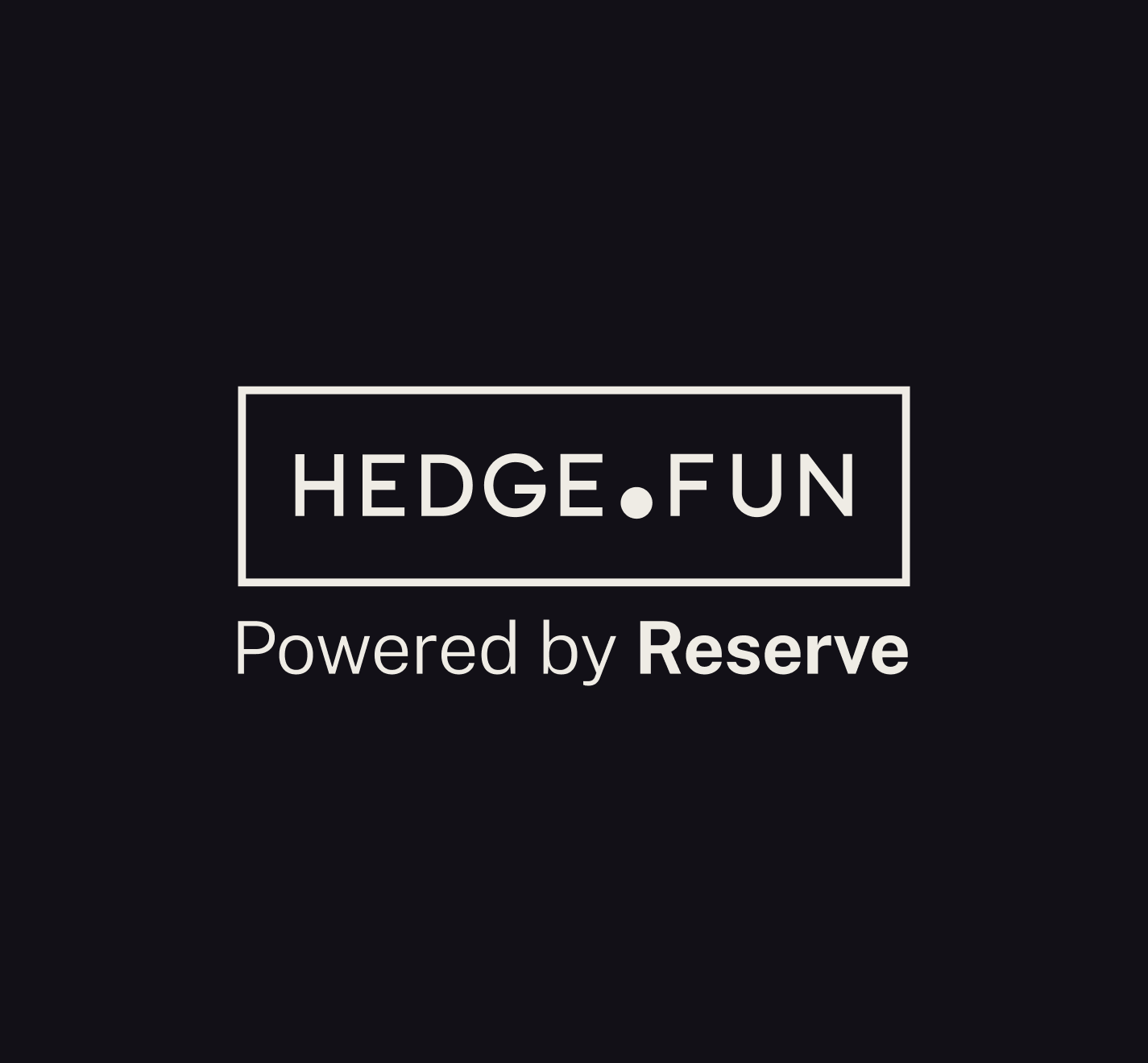
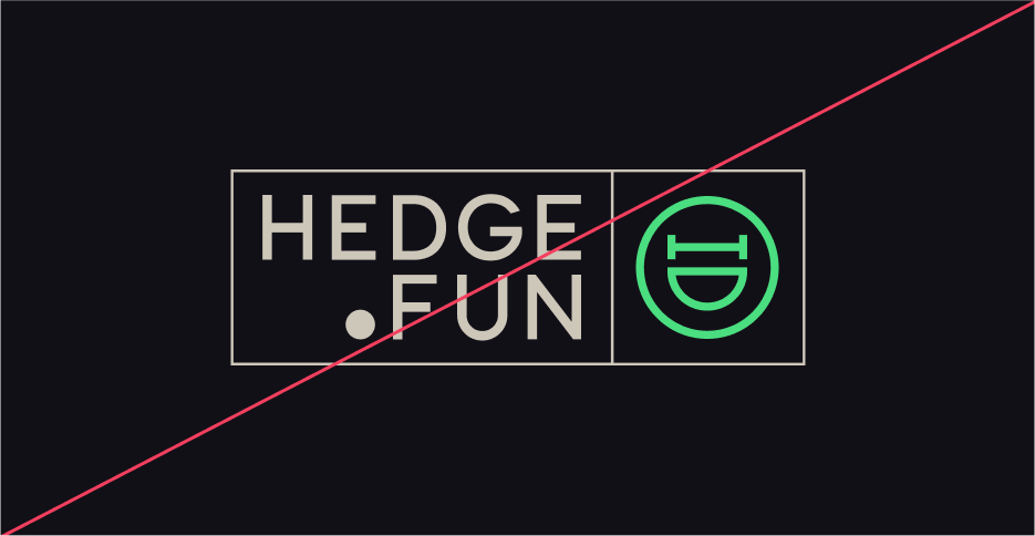
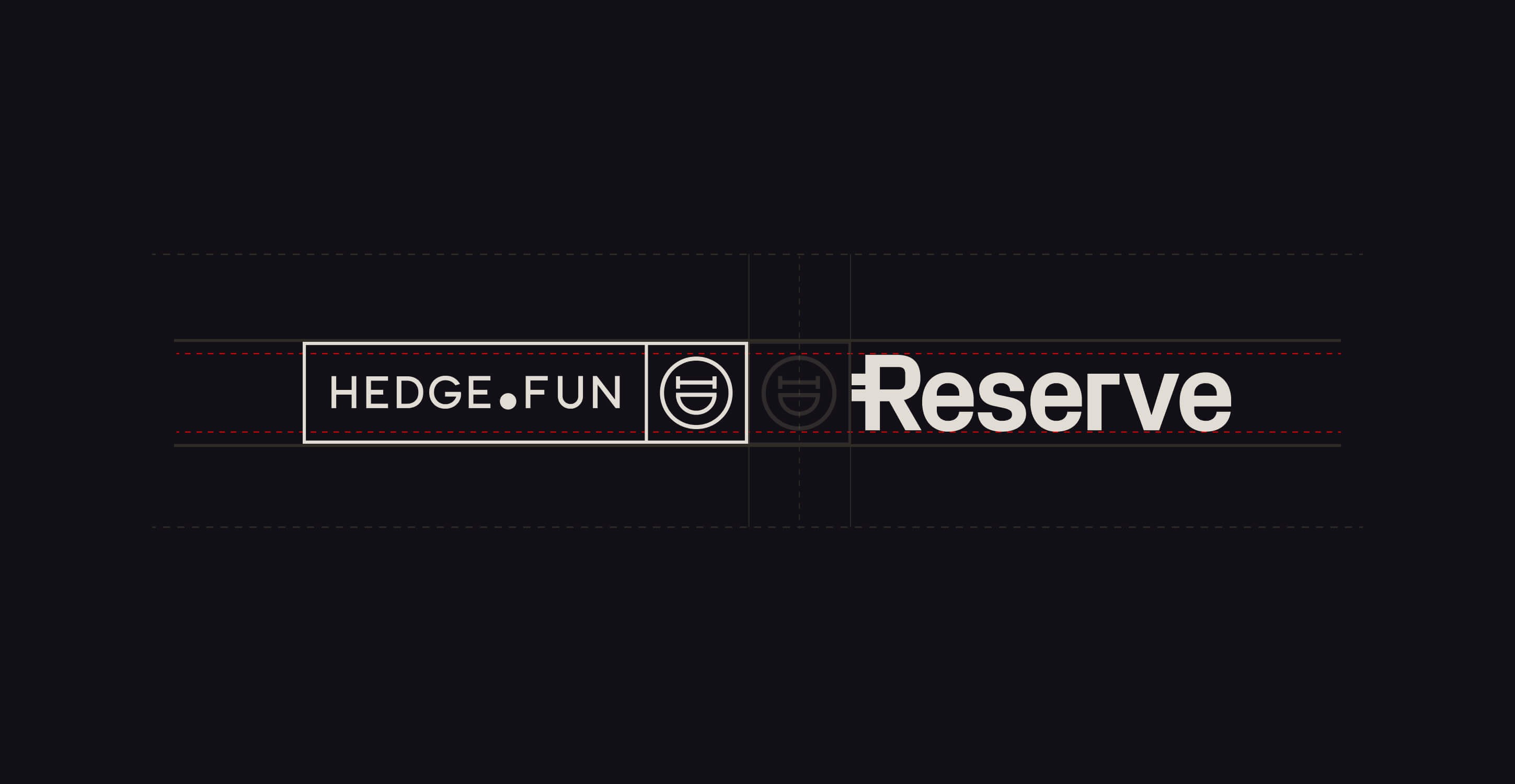
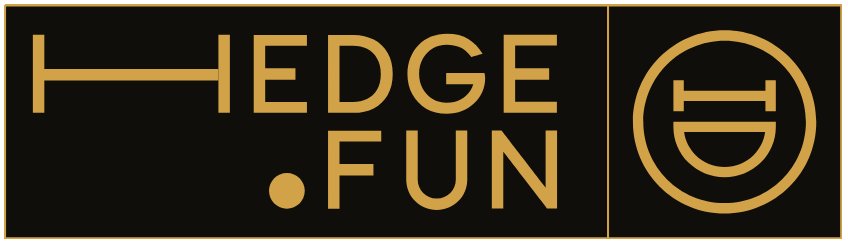
The Hedge.Fun logo is a simple, fun one.
It is composed by a minimalistic, and elegant structure that follows the golden ratio. In the left side of the structure lives the wordmark
3a
Primary Lockup
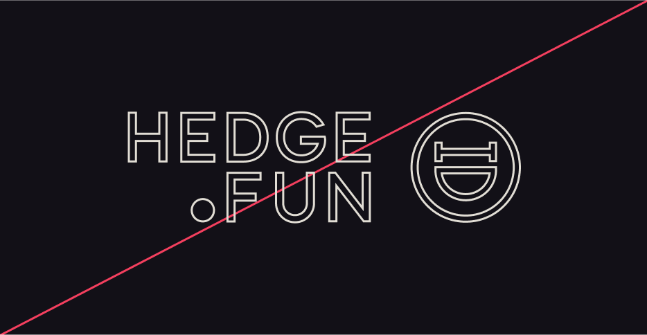
3b
Clearspace

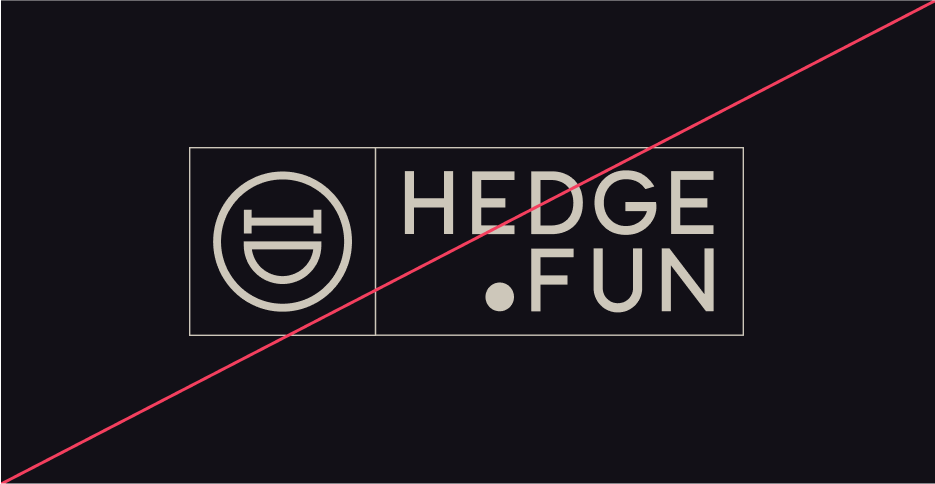
3c
Secondary Lockups

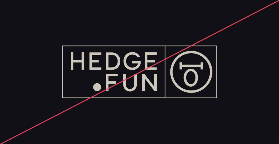
3d
Incorrect Usage

Do not change or distort the proportions
of the elements
Do not rotate the logo, or the icon alone.
Specially counterclockwise
Do not change the color of the mark alone,
or paint the logo in shades our of the primary palette
Do not outline the logo, or remove the containers
Do not reverse the order of the icon vs the wordmark
Do not alter the expression of the facewhen used in the full logo.
3e
Partnerships
04
Color
Hedge.Fun’s color palette aims to support a bigger visual concept: Minimalistic Lux.
Together, these colors define a clear vibe, where clarity is key, and emotions lead. The shiny thing in the creative work has tools to glow, and capture the eye’s attention and the mind’s imagination.
3a
Primary Palette
Black currant (500)
Hex: #24212E
Usage ratio: 80%
Merlin (100)
Hex: #908E80
Usage ratio: 5%
Off-White (100)
Hex: #E1DDD4
Usage ratio: 5%
3b
Custom Primitives
Black currant
This is a custom palette. To add to your Tailwind config include the collection to the @theme.Checked colors are recommended to be used on surfaces or borders.

100
#E4DDE6
200
#A8A2B7
300
#706981
400
#363143
500
#24212E
600
#1A1720
700
#121017
800
#0E0C12
900
#09080B
Off-white
This is a custom palette. To add to your Tailwind config include the collection to the @theme.
Checked colors are recommended to be used on text or borders.
50
#EFECE5
100
#E1DDD4
200
#CDC7BA
300
#B4AD9F
400
#A8A192
500
#9C9586
600
#898273
700
#7D7667
800
#736B5A
900
#5B564B
Merlin
This is a custom palette. To add to your Tailwind config include the collection to the @theme.
Checked colors are recommended to be used on text or borders.
100
#AEACA0
200
#908E80
300
#656459
400
#504E46
500
#3A3933
600
#32312B
700
#2A2925
800
#22211E
900
#191916
Gradient
This is a custom palette. To add to your Tailwind config include the collection to the @theme.
Checked colors are recommended to be used on text, borders or chart sequences.
Maize
#F9C15A
Lime
#C9BF90
Lemon
#FFF7D2
Cool Gray
#8B89B3
Violet
#524571
Raisin Black
#2D2839
Dark Pink
#866F89
3c
UI Color Tokens and Primitives
Success, Warning and Errors
The following colors are taken directly from the default Tailwind color primitives.
success
text/icons
green-400
success
borders
green-400/30
success
surface
green-400/5
warning
text/icons
yellow-300
warning
borders
yellow-300/30
warning
surface
yellow-300/5
error
text/icons
rose-500
error
borders
rose-500/30
error
surface
rose-500/5
Chart Variants - Bid/Ask
This is a custom palette. To add to your Tailwind config include the collection to the @theme.
Recommended to be used on candle charts. This palette has been tested for accessibility, and color blindness.
Bid
#7EB28E
Bid-dimmed (60%-opacity)
#7EB28E99
Ask
#963232
Ask-dimmed (60%-opacity)
#96323299
Charts variants - chromatic sequence
This is a custom palette. To add to your Tailwind config include the collection to the @theme.
Recommended to be used on distribution charts with up to 8 variables. This palette has been tested for accessibility, and color blindness.
var-1
#A6913F
var-2
#56742A
var-3
#5A68B7
var-4
#5C367D
var-5
#D55481
var-6
#397E76
var-7
#CE7234
var-8
#0D6398
Charts variants - chromatic sequence extended
This is a custom palette. To add to your Tailwind config include the collection to the @theme.
Recommended to be used on distribution charts with 9 - 16 variables.
var-1b
#E7DAA8
var-2b
#869E60
var-3b
#949FDD
var-4b
#A17BC2
var-5b
#CA799B
var-6b
#7EC1B9
var-7b
#D19F7E
var-8b
#7BA8C3
Charts variants - heatmap
This is a custom palette. To add to your Tailwind config include the collection to the @theme.
Recommended to be used on heatmap charts with up to 10 steps
cold-5
#154F67
cold-4
#306F6F
cold-3
#759D82
cold-2
#B4BA96
cold-1
#E5DABA
hot-1
#DBC671
hot-2
#C0A63F
hot-3
#A67717
hot-4
#A64917
hot-5
#A62817
05
Typography
Hedge.Fun type setting balances clarity and elegance, with a modern yet timeless type pairing.
Primary: Public Sans is a clean, modern sans-serif typeface that ensures legibility and precision in the product’s GUI. Its geometric structure reflects clarity, and efficiency, making it the ideal choice for data-heavy content, dashboards, and charts.
Secondary: Instrument Serif is a refined, serif font that adds a touch of elegance to a potential fun message. Used for emphasis in headlines and highlighted messages, and it is to be used when the brands expresses in its purest form.
Mono: Geist Mono is a support typeface, to be used mostly in the GUI, at discression of the designer. Potential use cases are, but not limited to: eyebrows. status reports, and the most crypto-native aspects of the rpoduct.
This sans-serif and serif combination creates a dynamic contrast—modern yet trustworthy, analytical yet approachable, ensuring Redo’s brand communication is always clear, professional, and dependable.
- Primary Typeface
Public Sans
Extra Light | Regular | Medium
Get the Font
- Secondary Typeface
Instrument Serif
Regular
Get the Font
- Mono Typeface
Geist Mono
Regular
Get the Font
5a
Styling
Basket Case?
Good
Display Headline: Sample Type Size > 72pt/px
100% Leading
-1% Tracking
Whether it’s a bank error, an unauthorized charge, or an overlooked refund, we ensure you don’t pay for something you shouldn’t have.
Headline: Type Sizes 24–72pt/px
110% Leading
-2% Tracking
Our team works diligently to recover lost funds, correct inaccuracies, and keep your financial records accurate—so you can feel confident about every dollar in your account.
Body: Type Sizes 12–20pt/px
130% Leading
-2% Tracking
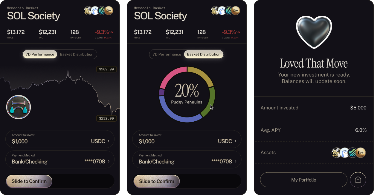
SOL Society | Memecoin Basket
Mono Labels & Eyebrows: Type Sizes 10–14pt/px
110% Leading
1% Tracking
$1,234.56
Figures & Stats: Type Sizes 14–72pt/px
100% Leading
-4% Tracking
06
Iconography
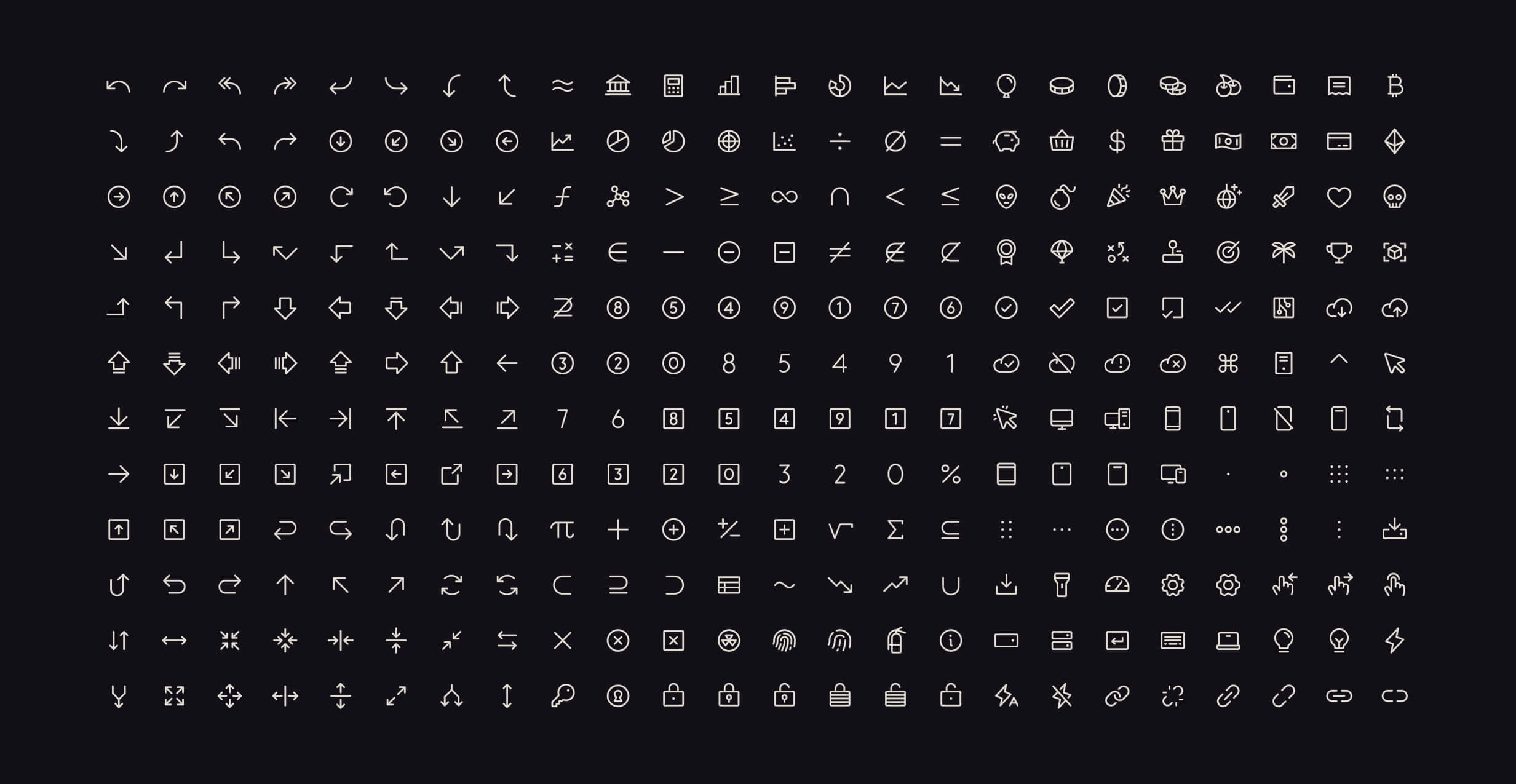
A versatile icon library is mandatory to support all the features and messages the product might need.
Phosphor is an open-source react icon library, that covers all potential use cases needed to convey a clear and clean UI to users.
The library has a Figma file and plugin for quick use in design workflows.
Have fun with it.
07
Art Direction
The visual expression of Hedge.Fun has a wide range of tools in its arsenal. From hedge-mojis, to stickers, to a multiverse of potential monogram adaptations; the idea is that the brand expresses that slightly-unhinged appeal when the opportunity arises.
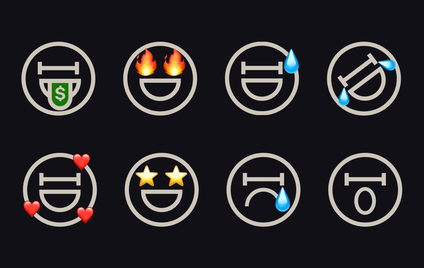
Hedge-mojies
Variations of the logo’s monogram. Can be used to express moments and sentiments in visual comunication.
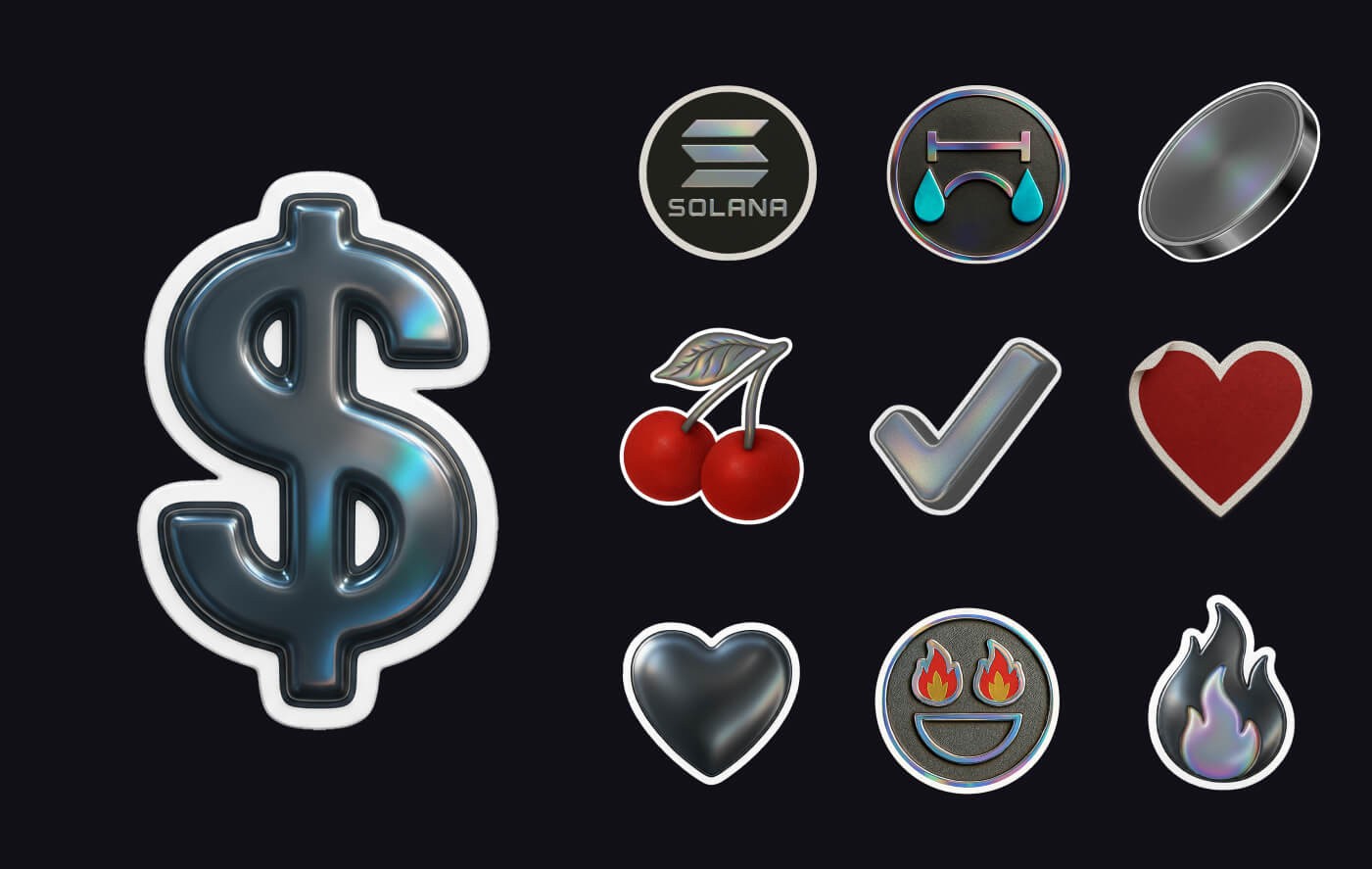
Stickers
Bringing the luxe vibe to the hook-moments in the app, these stickers can be used to decorate a somewhat technical text, and dress it up... or simply share them on Telegram.
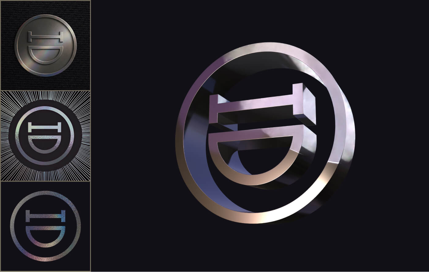
Hedgar styles
Hedgar can be represented in a series of art and material expressions. He can rotate in a 3D icon, or placed in different media, materials, or applications, from a pin in your suit, to an art deco painting in the back of the bar.
Urban Strokes
Use urban strokes sparringly as another form of brand expression
Golden Words
In certain instances, key headlines could be decorated with gradients to enhance the message.Don’t forget those inner shadows and the noise texture.
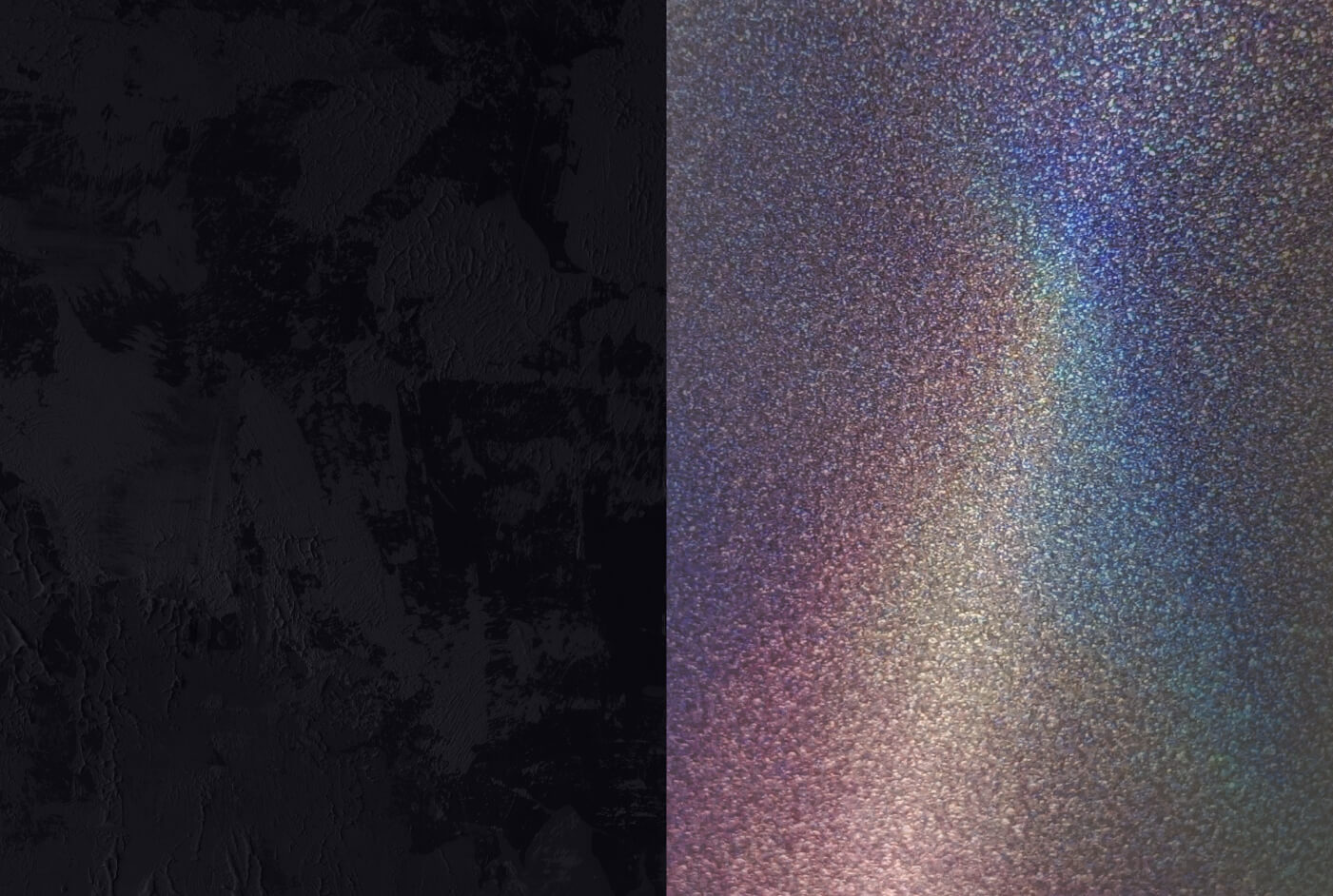
Textures
Use rough wall textures or chromed holographic texture, to boost the brand uniqueness.
08
Applications
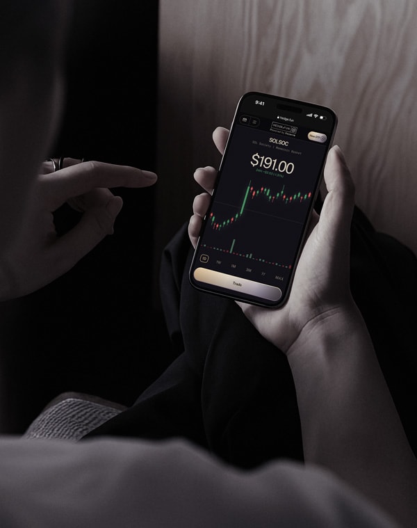
Redo’s photography style reinforces our brand’s core values—trust, clarity, and financial empowerment—by showcasing visuals that reflect professionalism, accuracy, and control.
Stickers can be used in the UI as confirmation messages, or over charts when a DTF is over or under performing.
X Profile Skin
Dynamic Logo
Mobile Web App
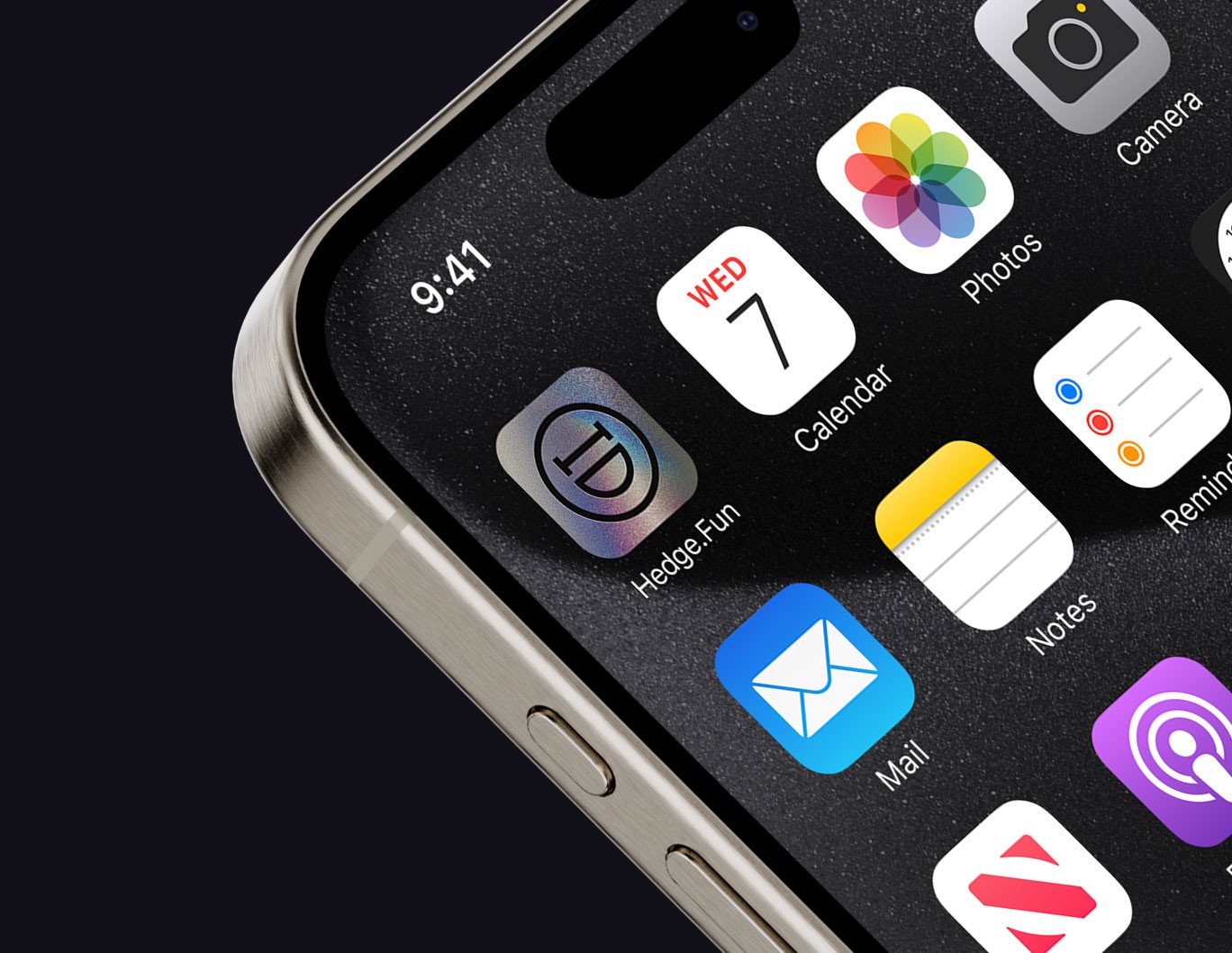
Native App Icon
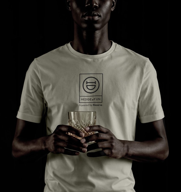
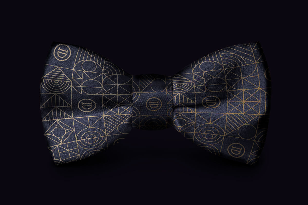
Swag

This is What
Winning Branding
Looks Like
Brand Guidelines
This guide sets the tone for how Hedge.fun shows up in the world. Inside, you’ll find the visual language, design principles, and core elements that keep our brand experience clear, elegant, and unmistakably ours — no matter who’s creating it or where it appears.
At its heart, Hedge.fun is about turning opportunity into something bold and tastefully unexpected. These pages define how we use color, typography, and accessible design to hold that promise together, while leaving space for curiosity and experimentation to shape what comes next.
Whether you’re designing a digital flow, a launch announcement, or a curated moment for our community, this guide ensures every touchpoint carries the same quiet confidence, sly charm, and welcoming edge that make Hedge.fun feel like the best room in the house.
Contents
01
Brand Strategy
02
Personality
03
Logo
04
Color
05
Typography
06
Iconography
07
Art Direction
08
Applications
01
Brand Strategy
There’s a party at a bar tonight. The kind that feels like you need the right name on the right list. You check your pocket for the invitation, but it’s not there. Then you spot Hedgar by the back door, half-hidden in the alley. He catches your eye, grins, and waves you over. “Come on,” he gestures. You slip past the door behind him.
Inside, you pause. The room hums with style you’re not sure you carry yet. That creeping sense of “Am I supposed to be here?” curls up your spine. Then Hedgar looks back at you from across the bar, lifts his glass with a knowing nod, and it all settles: you’re exactly where you’re meant to be.
That is Hedge.Fun. A platform that gives everyone the chance to hold crypto assets with style, no matter how you start or how crazy a move might look. Build baskets that balance risk with taste, without needing a fortune to look the part. Come curious, come casual, come as you are. We’ll make sure to celebrate your wins, and cheer up for the looses.
🚪 The back door is the simple UI: you’re in, no complex initiation.
😎 Hedgar’s nod is the brand’s promise: “Relax! you’re holding well, you’re good.”
🥃 The party is the curated baskets, the stories, the style, the capital arranged tastefully.
😉 The strange feeling is the fear of crypto complexity. Hedgar dispels it with a wink.
1a
Brand Fundamentals
Our Mission: what we do
To make holding well feel effortless, tasteful, and thrilling — by turning diversification into an experience anyone can step into, style their way, and share with pride.”
Our Promise: how we help
We promise to share every opportunity. No gatekeeping, no exclusive clubs — just smart baskets you can make your own. Come as you are, hold like you mean it, and leave with a portfolio to celebrate.
Our Vision: why we exist
A world where anyone can step on-chain, build baskets as stylish as they are smart, and hold their capital with the same flair they live their life — open, confident, never ordinary.
02
Personality
2a
How Does Hedge.Fun Talk
In short Hedge.Fun is...
✅ Open, but not cheap. It’s still a good party, a place you want to be. The door just isn’t obvious to everyone.
✅ Inclusive, but with a nod to taste. You’re here because you get it; or you’re willing to learn it.
✅ Encouraging and challenging. Trusts your potential.
✅ Charm replaces status. It’s not about who you know in high society. It’s about the confidence you carry once you’re in.
Hedge.fun is a charming provocateur in the world of crypto investing. It knows where the hidden door is and how to open it for anyone curious enough to step inside.
The personality is confident but never loud, balancing elegance with a sly grin that makes diversification feel like an experience worth sharing with everyone, regardless of their previous experience.
Come as you are, stay as long as you like, and leave looking better than when you arrived.
This brand speaks like a connoisseur friend to our two core audiences with different intents:
- The Creators
- The retail investor/investigator
2b
Towards Creators
When talking to creators, the brand will aim for giving any anon the chance to prove themselves. To prove that they deserve to manage money. It doesn't matter if they are boomer who discovered Ripple memes and realized they're better than all the so-called degens at trading; or a 15-year-old who's chronically online with a YOLO mindset.
Hedge.fun lets them create a track record. The idea is that they can start with a little pool of capital, just their own money, show their work, prove to the world that they know what they're doing, As they amass true believers because their portfolio is crushing it, those believers can invest directly in their "folio".
for its closest friends, he is still encouraging, but also challenging: "Prove you can do it. I believe in you"for retail, he is the guys that always compliments and shares warmth
2c
Towards Retail
When talking to retail traders, the brand will always encourage to explore their potential, and the oportunities ahead.
It will invite people to come and poke around, learn what always-on traders are up to, get a sense of what's trending, what the vibes are, maybe see some thought pieces, maybe bookmark and follow some people to see if they want to give them their money in the long term. It's a little bit like collecting Pokemon. It's a little bit like following someone on Twitter. It's a little bit like GMGN.
aim for giving any anon the chance to prove themselves. To prove that they deserve to manage money. It doesn't matter if they are boomer who discovered ripple memes and realized they're better than all the so-called degens at trading, or a 15-year-old who's chronically online with a YOLO mindset.
Hedge.fun lets them create a track record. The idea is that they can start with a little pool of capital, just their own money, show their work, prove to the world that they know what they're doing, As they amass true believers because their portfolio is crushing it, those believers can invest directly in their "folio".
1b
Tagline Samples
This is what winning looks like.
Alpha doesn’t screenshot itself.
The leaderboard is open.
Track records over hot takes.
03
Logo
The Hedge.Fun logo is a simple, fun one.
It is composed by a minimalistic, and elegant structure that follows the golden ratio. In the left side of the structure lives the wordmark
3a
Primary Lockup
3b
Clearspace
3c
Secondary Lockups
3d
Incorrect Usage
Do not change or distort the proportions
of the elements
Do not rotate the logo, or the icon alone.
Specially counterclockwise
Do not change the color of the mark alone,
or paint the logo in shades our of the primary palette
Do not outline the logo, or remove the containers
Do not reverse the order of the icon vs the wordmark
Do not alter the expression of the facewhen used in the full logo.
3e
Partnerships
04
Color
Hedge.Fun’s color palette aims to support a bigger visual concept: Minimalistic Lux.
Together, these colors define a clear vibe, where clarity is key, and emotions lead. The shiny thing in the creative work has tools to glow, and capture the eye’s attention and the mind’s imagination.
3a
Primary Palette
Black currant (500)
Hex: #24212E
Usage ratio: 80%
Merlin (100)
Hex: #908E80
Usage ratio: 5%
Off-White (100)
Hex: #E1DDD4
Usage ratio: 5%
3b
Custom Primitives
Black currant
This is a custom palette. To add to your Tailwind config include the collection to the @theme.Checked colors are recommended to be used on surfaces or borders.
100
#E4DDE6
200
#A8A2B7
300
#706981
400
#363143
500
#24212E
600
#1A1720
700
#121017
800
#0E0C12
900
#09080B
Off-white
This is a custom palette. To add to your Tailwind config include the collection to the @theme.
Checked colors are recommended to be used on text or borders.
50
#EFECE5
100
#E1DDD4
200
#CDC7BA
300
#B4AD9F
400
#A8A192
500
#9C9586
600
#898273
700
#7D7667
800
#736B5A
900
#5B564B
Merlin
This is a custom palette. To add to your Tailwind config include the collection to the @theme.
Checked colors are recommended to be used on text or borders.
100
#AEACA0
200
#908E80
300
#656459
400
#504E46
500
#3A3933
600
#32312B
700
#2A2925
800
#22211E
900
#191916
Gradient
This is a custom palette. To add to your Tailwind config include the collection to the @theme.
Checked colors are recommended to be used on text, borders or chart sequences.
Maize
#F9C15A
Lime
#C9BF90
Lemon
#FFF7D2
Cool Gray
#8B89B3
Violet
#524571
Raisin Black
#2D2839
Dark Pink
#866F89
3c
UI Color Tokens and Primitives
Success, Warning and Errors
The following colors are taken directly from the default Tailwind color primitives.
success
text/icons
green-400
success
borders
green-400/30
success
surface
green-400/5
warning
text/icons
yellow-300
warning
borders
yellow-300/30
warning
surface
yellow-300/5
error
text/icons
rose-500
error
borders
rose-500/30
error
surface
rose-500/5
Chart Variants - Bid/Ask
This is a custom palette. To add to your Tailwind config include the collection to the @theme.
Recommended to be used on candle charts. This palette has been tested for accessibility, and color blindness.
Bid
#7EB28E
Bid-dimmed (60%-opacity)
#7EB28E99
Ask
#963232
Ask-dimmed (60%-opacity)
#96323299
Charts variants - chromatic sequence
This is a custom palette. To add to your Tailwind config include the collection to the @theme.
Recommended to be used on distribution charts with up to 8 variables. This palette has been tested for accessibility, and color blindness.
var-1
#A6913F
var-2
#56742A
var-3
#5A68B7
var-4
#5C367D
var-5
#D55481
var-6
#397E76
var-7
#CE7234
var-8
#0D6398
Charts variants - chromatic sequence extended
This is a custom palette. To add to your Tailwind config include the collection to the @theme.
Recommended to be used on distribution charts with 9 - 16 variables.
var-1b
#E7DAA8
var-2b
#869E60
var-3b
#949FDD
var-4b
#A17BC2
var-5b
#CA799B
var-6b
#7EC1B9
var-7b
#D19F7E
var-8b
#7BA8C3
Charts variants - heatmap
This is a custom palette. To add to your Tailwind config include the collection to the @theme.
Recommended to be used on heatmap charts with up to 10 steps
cold-5
#154F67
cold-4
#306F6F
cold-3
#759D82
cold-2
#B4BA96
cold-1
#E5DABA
hot-1
#DBC671
hot-2
#C0A63F
hot-3
#A67717
hot-4
#A64917
hot-5
#A62817
05
Typography
Hedge.Fun type setting balances clarity and elegance, with a modern yet timeless type pairing.
Primary: Public Sans is a clean, modern sans-serif typeface that ensures legibility and precision in the product’s GUI. Its geometric structure reflects clarity, and efficiency, making it the ideal choice for data-heavy content, dashboards, and charts.
Secondary: Instrument Serif is a refined, serif font that adds a touch of elegance to a potential fun message. Used for emphasis in headlines and highlighted messages, and it is to be used when the brands expresses in its purest form.
Mono: Geist Mono is a support typeface, to be used mostly in the GUI, at discression of the designer. Potential use cases are, but not limited to: eyebrows. status reports, and the most crypto-native aspects of the rpoduct.
This sans-serif and serif combination creates a dynamic contrast—modern yet trustworthy, analytical yet approachable, ensuring Redo’s brand communication is always clear, professional, and dependable.
- Primary Typeface
Public Sans
Extra Light | Regular | Medium
Get the Font
- Secondary Typeface
Instrument Serif
Regular
Get the Font
- Mono Typeface
Geist Mono
Regular
Get the Font
5a
Styling
Basket Case?
Good
Display Headline: Sample Type Size > 72pt/px
100% Leading
-1% Tracking
Whether it’s a bank error, an unauthorized charge, or an overlooked refund, we ensure you don’t pay for something you shouldn’t have.
Headline: Type Sizes 24–72pt/px
110% Leading
-2% Tracking
Our team works diligently to recover lost funds, correct inaccuracies, and keep your financial records accurate—so you can feel confident about every dollar in your account.
Body: Type Sizes 12–20pt/px
130% Leading
-2% Tracking
SOL Society | Memecoin Basket
Mono Labels & Eyebrows: Type Sizes 10–14pt/px
110% Leading
1% Tracking
$1,234.56
Figures & Stats: Type Sizes 14–72pt/px
100% Leading
-4% Tracking
06
Iconography
A versatile icon library is mandatory to support all the features and messages the product might need.
Phosphor is an open-source react icon library, that covers all potential use cases needed to convey a clear and clean UI to users.
The library has a Figma file and plugin for quick use in design workflows.
Have fun with it.
07
Art Direction
The visual expression of Hedge.Fun has a wide range of tools in its arsenal. From hedge-mojis, to stickers, to a multiverse of potential monogram adaptations; the idea is that the brand expresses that slightly-unhinged appeal when the opportunity arises.
Hedge-mojies
Variations of the logo’s monogram. Can be used to express moments and sentiments in visual comunication.
Stickers
Bringing the luxe vibe to the hook-moments in the app, these stickers can be used to decorate a somewhat technical text, and dress it up... or simply share them on Telegram.
Hedgar styles
Hedgar can be represented in a series of art and material expressions. He can rotate in a 3D icon, or placed in different media, materials, or applications, from a pin in your suit, to an art deco painting in the back of the bar.
Golden Words
In certain instances, key headlines could be decorated with gradients to enhance the message.Don’t forget those inner shadows and the noise texture.
Urban Strokes
Use urban strokes sparringly as another form of brand expression
Textures
Use rough wall textures or chromed holographic texture, to boost the brand uniqueness.
08
Applications
Redo’s photography style reinforces our brand’s core values—trust, clarity, and financial empowerment—by showcasing visuals that reflect professionalism, accuracy, and control.
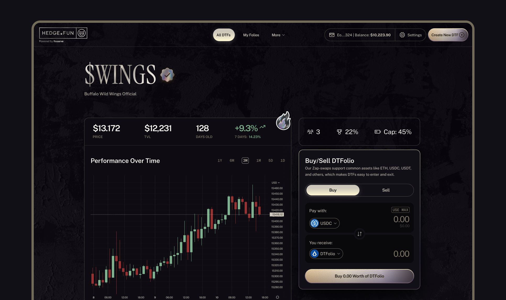
Stickers can be used in the UI as confirmation messages, or over charts when a DTF is over or under performing.
X Profile Skin
Dynamic Logo
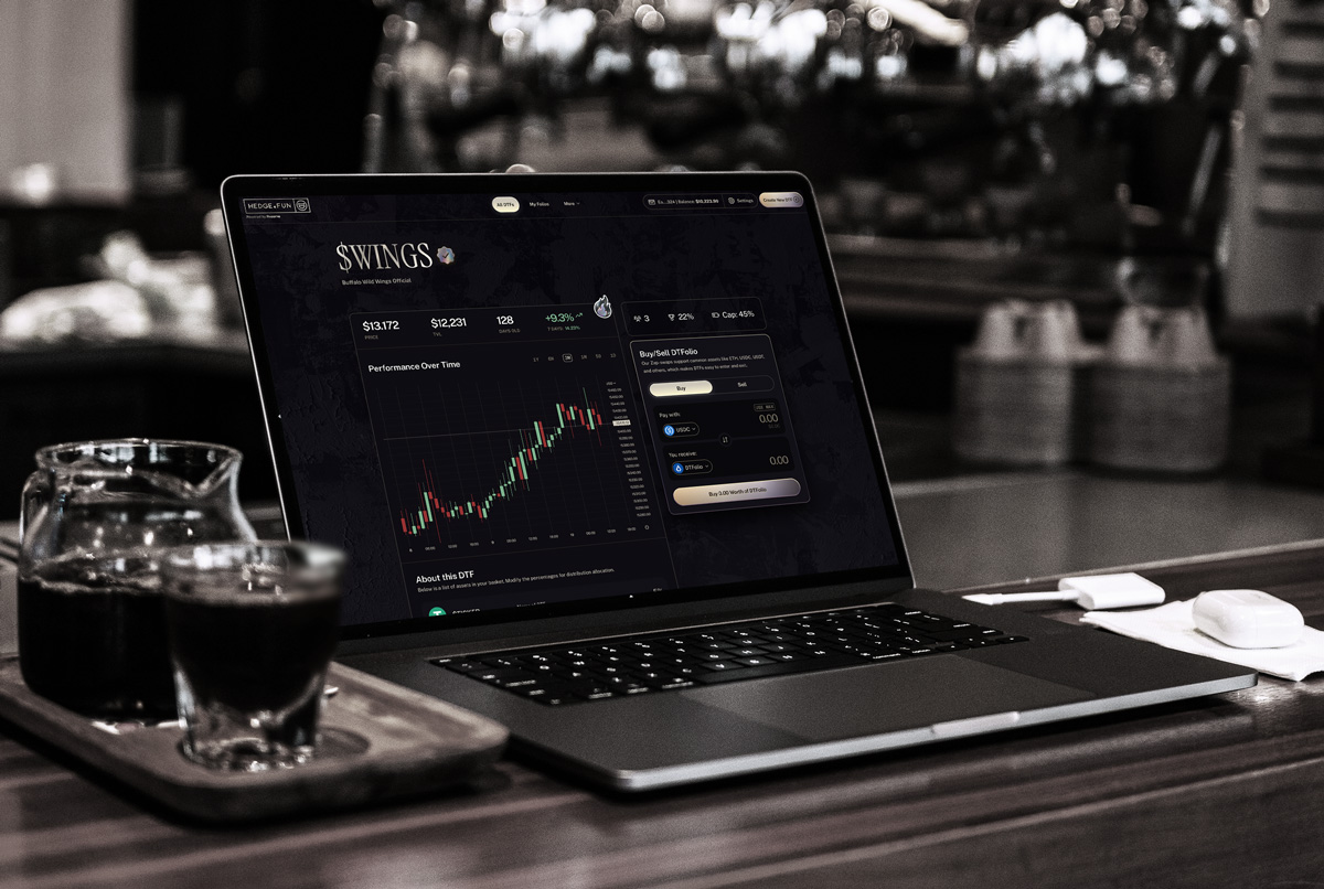
Mobile Web App
Native App Icon
Swag


©SitBak Design
All Rights Reserved
Back to the top
↑
This is What
Winning Branding
Looks Like
Brand Guidelines
This guide sets the tone for how Hedge.fun shows up in the world. Inside, you’ll find the visual language, design principles, and core elements that keep our brand experience clear, elegant, and unmistakably ours — no matter who’s creating it or where it appears.
At its heart, Hedge.fun is about turning opportunity into something bold and tastefully unexpected. These pages define how we use color, typography, and accessible design to hold that promise together, while leaving space for curiosity and experimentation to shape what comes next.
Whether you’re designing a digital flow, a launch announcement, or a curated moment for our community, this guide ensures every touchpoint carries the same quiet confidence, sly charm, and welcoming edge that make Hedge.fun feel like the best room in the house.
Contents
01
Brand Strategy
02
Personality
03
Logo
04
Color
05
Typography
06
Iconography
07
Art Direction
08
Applications
01
Brand Strategy
There’s a party at a bar tonight. The kind that feels like you need the right name on the right list. You check your pocket for the invitation, but it’s not there. Then you spot Hedgar by the back door, half-hidden in the alley. He catches your eye, grins, and waves you over. “Come on,” he gestures. You slip past the door behind him.
Inside, you pause. The room hums with style you’re not sure you carry yet. That creeping sense of “Am I supposed to be here?” curls up your spine. Then Hedgar looks back at you from across the bar, lifts his glass with a knowing nod, and it all settles: you’re exactly where you’re meant to be.
That is Hedge.Fun. A platform that gives everyone the chance to hold crypto assets with style, no matter how you start or how crazy a move might look. Build baskets that balance risk with taste, without needing a fortune to look the part. Come curious, come casual, come as you are. We’ll make sure to celebrate your wins, and cheer up for the looses.
🚪 The back door is the simple UI: you’re in, no complex initiation.
😎 Hedgar’s nod is the brand’s promise: “Relax! you’re holding well, you’re good.”
🥃 The party is the curated baskets, the stories, the style, the capital arranged tastefully.
😉 The strange feeling is the fear of crypto complexity. Hedgar dispels it with a wink.
1a
Brand Fundamentals
Our Mission: what we do
To make holding well feel effortless, tasteful, and thrilling — by turning diversification into an experience anyone can step into, style their way, and share with pride.”
Our Promise: how we help
We promise to share every opportunity. No gatekeeping, no exclusive clubs — just smart baskets you can make your own. Come as you are, hold like you mean it, and leave with a portfolio to celebrate.
Our Vision: why we exist
A world where anyone can step on-chain, build baskets as stylish as they are smart, and hold their capital with the same flair they live their life — open, confident, never ordinary.
02
Personality
2a
How Does Hedge.Fun Talk
In short Hedge.Fun is...
✅ Open, but not cheap. It’s still a good party, a place you want to be. The door just isn’t obvious to everyone.
✅ Inclusive, but with a nod to taste. You’re here because you get it; or you’re willing to learn it.
✅ Encouraging and challenging. Trusts your potential.
✅ Charm replaces status. It’s not about who you know in high society. It’s about the confidence you carry once you’re in.
Hedge.fun is a charming provocateur in the world of crypto investing. It knows where the hidden door is and how to open it for anyone curious enough to step inside.
The personality is confident but never loud, balancing elegance with a sly grin that makes diversification feel like an experience worth sharing with everyone, regardless of their previous experience.
Come as you are, stay as long as you like, and leave looking better than when you arrived.
This brand speaks like a connoisseur friend to our two core audiences with different intents:
- The Creators
- The retail investor/investigator
2b
Towards Creators
TL;DR: for its closest friends (creators), the brand is encouraging, but also challenging: "Prove you can do it. I believe in you"
When talking to creators, the brand will aim for giving any anon the chance to prove themselves. To prove that they deserve to manage money. It doesn't matter if they are boomer who discovered Ripple memes and realized they're better than all the so-called degens at trading; or a 15-year-old who's chronically online with a YOLO mindset.
Hedge.fun lets them create a track record. The idea is that they can start with a little pool of capital, just their own money, show their work, prove to the world that they know what they're doing, As they amass true believers because their portfolio is crushing it, those believers can invest directly in their "folio".
2c
Towards Retail
When talking to retail traders, the brand will always encourage to explore their potential, and the opportunities ahead with warmth.
It will invite people to come and poke around, learn what always-on traders are up to, get a sense of what's trending, what the vibes are, maybe see some thought pieces, maybe bookmark and follow some people to see if they want to give them their money in the long term.
Trust your instinct. You are already here.
1b
Tagline Samples
This is what winning looks like.
Alpha doesn’t screenshot itself.
The leaderboard is open.
Track records over hot takes.
03
Logo
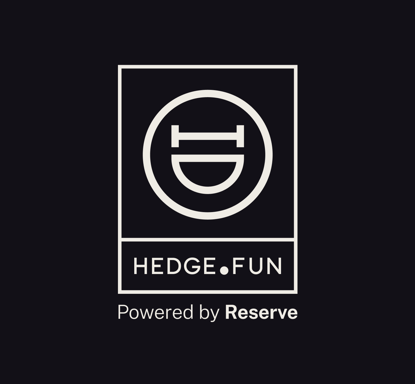
The Hedge.Fun logo is a simple, fun one.
It is composed by a minimalistic, and elegant structure that follows the golden ratio. In the left side of the structure lives the wordmark, split in 2 lines for the primary usage, and a very prominent “dot”, as the spoken brand places it as part of its rhythm:”Hedge - Dot - Fun”.
The right side has the smile of Hedgar. He is a Hedge-moji. Always smiling. Always having FUN. Hedgar is a visual abbreviation of the name. His ayes are made with an H. The body is circular like a dot. And his big smile represent all the fun he carries.
Simple. Clear
3a
Primary Lockup
3b
Clearspace
3c
Secondary Lockups
3d
Incorrect Usage
Do not change or distort the proportions
of the elements
Do not rotate the logo, or the icon alone.
Specially counterclockwise
Do not change the color of the mark alone,
or paint the logo in shades our of the primary palette
Do not outline the logo, or remove the containers
Do not reverse the order of the icon vs the wordmark
Do not alter the expression of the facewhen used in the full logo.
3e
Partnerships
04
Color
Hedge.Fun’s color palette aims to support a bigger visual concept: Minimalistic Lux.
Together, these colors define a clear vibe, where clarity is key, and emotions lead. The shiny thing in the creative work has tools to glow, and capture the eye’s attention and the mind’s imagination.
3a
Primary Palette
Black currant (500)
Hex: #24212E
Usage ratio: 80%
Merlin (100)
Hex: #908E80
Usage ratio: 5%
Off-White (100)
Hex: #E1DDD4
Usage ratio: 5%
3b
Custom Primitives
Black currant
This is a custom palette. To add to your Tailwind config include the collection to the @theme.Checked colors are recommended to be used on surfaces or borders.
100
#E4DDE6
200
#A8A2B7
300
#706981
400
#363143
500
#24212E
600
#1A1720
700
#121017
800
#0E0C12
900
#09080B
Off-white
This is a custom palette. To add to your Tailwind config include the collection to the @theme.
Checked colors are recommended to be used on text or borders.
50
#EFECE5
100
#E1DDD4
200
#CDC7BA
300
#B4AD9F
400
#A8A192
500
#9C9586
600
#898273
700
#7D7667
800
#736B5A
900
#5B564B
Merlin
This is a custom palette. To add to your Tailwind config include the collection to the @theme.
Checked colors are recommended to be used on text or borders.
100
#AEACA0
200
#908E80
300
#656459
400
#504E46
500
#3A3933
600
#32312B
700
#2A2925
800
#22211E
900
#191916
Gradient
This is a custom palette. To add to your Tailwind config include the collection to the @theme.
Checked colors are recommended to be used on text, borders or chart sequences.
Maize
#F9C15A
Lime
#C9BF90
Lemon
#FFF7D2
Cool Gray
#8B89B3
Violet
#524571
Raisin Black
#2D2839
Dark Pink
#866F89
3c
UI Color Tokens and Primitives
Success, Warning and Errors
The following colors are taken directly from the default Tailwind color primitives.
success
text/icons
green-400
success
borders
green-400/30
success
surface
green-400/5
warning
text/icons
yellow-300
warning
borders
yellow-300/30
warning
surface
yellow-300/5
error
text/icons
rose-500
error
borders
rose-500/30
error
surface
rose-500/5
Chart Variants - Bid/Ask
This is a custom palette. To add to your Tailwind config include the collection to the @theme.
Recommended to be used on candle charts. This palette has been tested for accessibility, and color blindness.
Bid
#7EB28E
Bid-dimmed (60%-opacity)
#7EB28E99
Ask
#963232
Ask-dimmed (60%-opacity)
#96323299
Charts variants - chromatic sequence
This is a custom palette. To add to your Tailwind config include the collection to the @theme.
Recommended to be used on distribution charts with up to 8 variables. This palette has been tested for accessibility, and color blindness.
var-1
#A6913F
var-2
#56742A
var-3
#5A68B7
var-4
#5C367D
var-5
#D55481
var-6
#397E76
var-7
#CE7234
var-8
#0D6398
Charts variants - chromatic sequence extended
This is a custom palette. To add to your Tailwind config include the collection to the @theme.
Recommended to be used on distribution charts with 9 - 16 variables.
var-1b
#E7DAA8
var-2b
#869E60
var-3b
#949FDD
var-4b
#A17BC2
var-5b
#CA799B
var-6b
#7EC1B9
var-7b
#D19F7E
var-8b
#7BA8C3
Charts variants - heatmap
This is a custom palette. To add to your Tailwind config include the collection to the @theme.
Recommended to be used on heatmap charts with up to 10 steps
cold-5
#154F67
cold-4
#306F6F
cold-3
#759D82
cold-2
#B4BA96
cold-1
#E5DABA
hot-1
#DBC671
hot-2
#C0A63F
hot-3
#A67717
hot-4
#A64917
hot-5
#A62817
05
Typography
Hedge.Fun type setting balances clarity and elegance, with a modern yet timeless type pairing.
Primary: Public Sans is a clean, modern sans-serif typeface that ensures legibility and precision in the product’s GUI. Its geometric structure reflects clarity, and efficiency, making it the ideal choice for data-heavy content, dashboards, and charts.
Secondary: Instrument Serif is a refined, serif font that adds a touch of elegance to a potential fun message. Used for emphasis in headlines and highlighted messages, and it is to be used when the brands expresses in its purest form.
Mono: Geist Mono is a support typeface, to be used mostly in the GUI, at discretion of the designer. Potential use cases are, but not limited to: eyebrows. status reports, and the most crypto-native aspects of the product.
- Primary Typeface
Public Sans
Extra Light | Regular | Medium
Get the Font
- Secondary Typeface
Instrument Serif
Regular
Get the Font
- Mono Typeface
Geist Mono
Regular
Get the Font
5a
Styling
Basket Case?
Good
Display Headline: Sample Type Size > 72pt/px
100% Leading
-1% Tracking
Whether it’s a bank error, an unauthorized charge, or an overlooked refund, we ensure you don’t pay for something you shouldn’t have.
Headline: Type Sizes 24–72pt/px
110% Leading
-2% Tracking
Our team works diligently to recover lost funds, correct inaccuracies, and keep your financial records accurate—so you can feel confident about every dollar in your account.
Body: Type Sizes 12–20pt/px
130% Leading
-2% Tracking
SOL Society | Memecoin Basket
Mono Labels & Eyebrows: Type Sizes 10–14pt/px
110% Leading
1% Tracking
$1,234.56
Figures & Stats: Type Sizes 14–72pt/px
100% Leading
-4% Tracking
06
Iconography
A versatile icon library is mandatory to support all the features and messages the product might need.
Phosphor is an open-source react icon library, that covers all potential use cases needed to convey a clear and clean UI to users.
The library has a Figma file and plugin for quick use in design workflows.
Have fun with it.
07
Art Direction
The visual expression of Hedge.Fun has a wide range of tools in its arsenal. From hedge-mojis, to stickers, to a multiverse of potential monogram adaptations; the idea is that the brand expresses that slightly-unhinged appeal when the opportunity arises.
Hedge-mojies
Variations of the logo’s monogram. Can be used to express moments and sentiments in visual comunication.
Stickers
Bringing the luxe vibe to the hook-moments in the app, these stickers can be used to decorate a somewhat technical text, and dress it up... or simply share them on Telegram.
Hedgar styles
Hedgar can be represented in a series of art and material expressions. He can rotate in a 3D icon, or placed in different media, materials, or applications, from a pin in your suit, to an art deco painting in the back of the bar.
Golden Words
In certain instances, key headlines could be decorated with gradients to enhance the message.Don’t forget those inner shadows and the noise texture.
Urban Strokes
Use urban strokes sparingly as another form of brand expression, to convey a tone in a composition or as ornamental details.
Textures
Use rough wall textures or chromed holographic texture, to boost the brand uniqueness.
08
Applications
Redo’s photography style reinforces our brand’s core values—trust, clarity, and financial empowerment—by showcasing visuals that reflect professionalism, accuracy, and control.
Stickers can be used in the UI as confirmation messages, or over charts when a DTF is over or under performing.
X Profile Skin
Dynamic Logo
Mobile Web App
Native App Icon
Swag